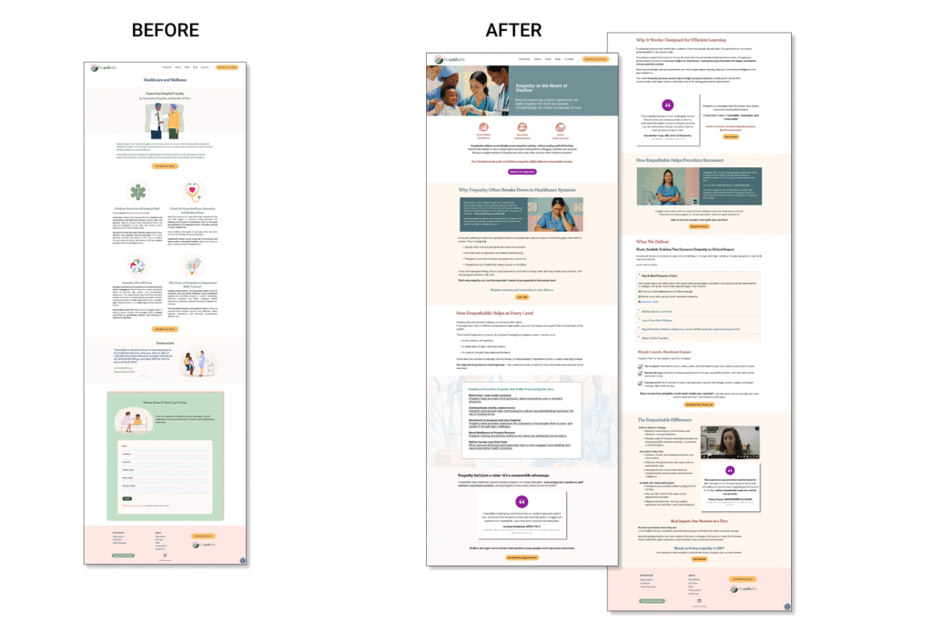
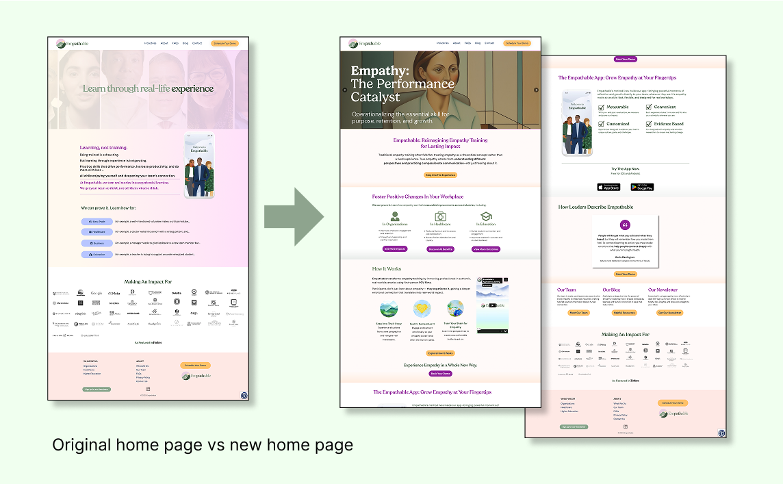
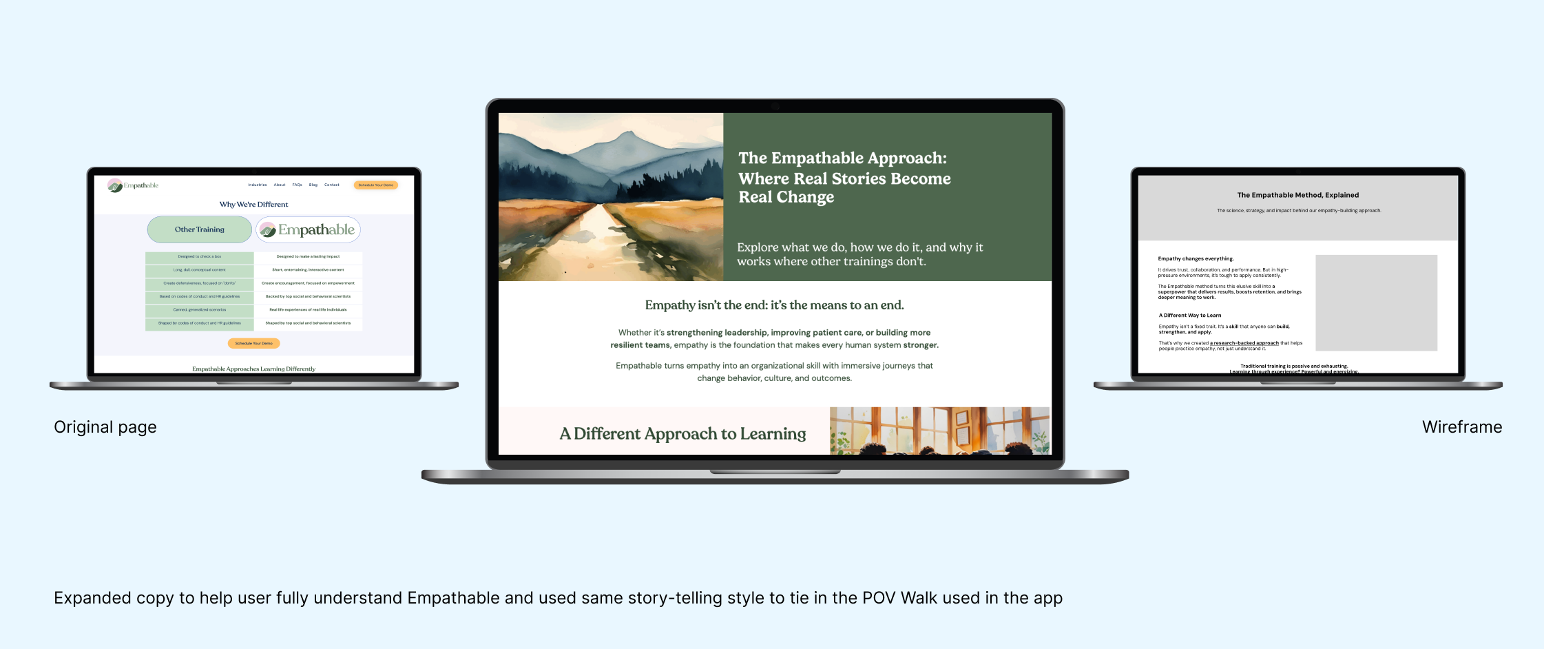
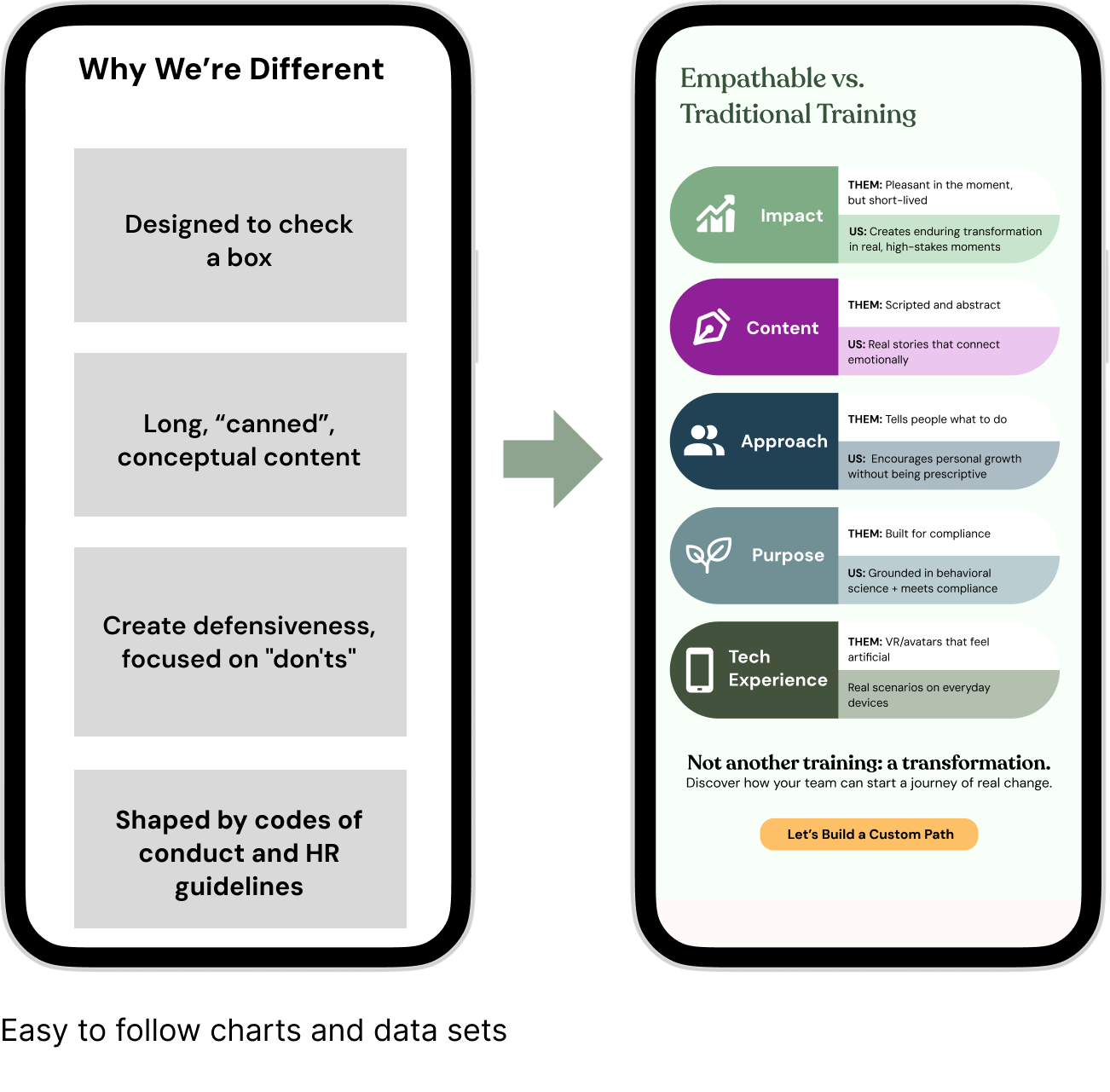
Led UX + visual design direction (navigation, hierarchy, visual tone, CTAs)
Proposed innovations beyond scope: proof integration, narrative scroll paths, outcome-first messaging
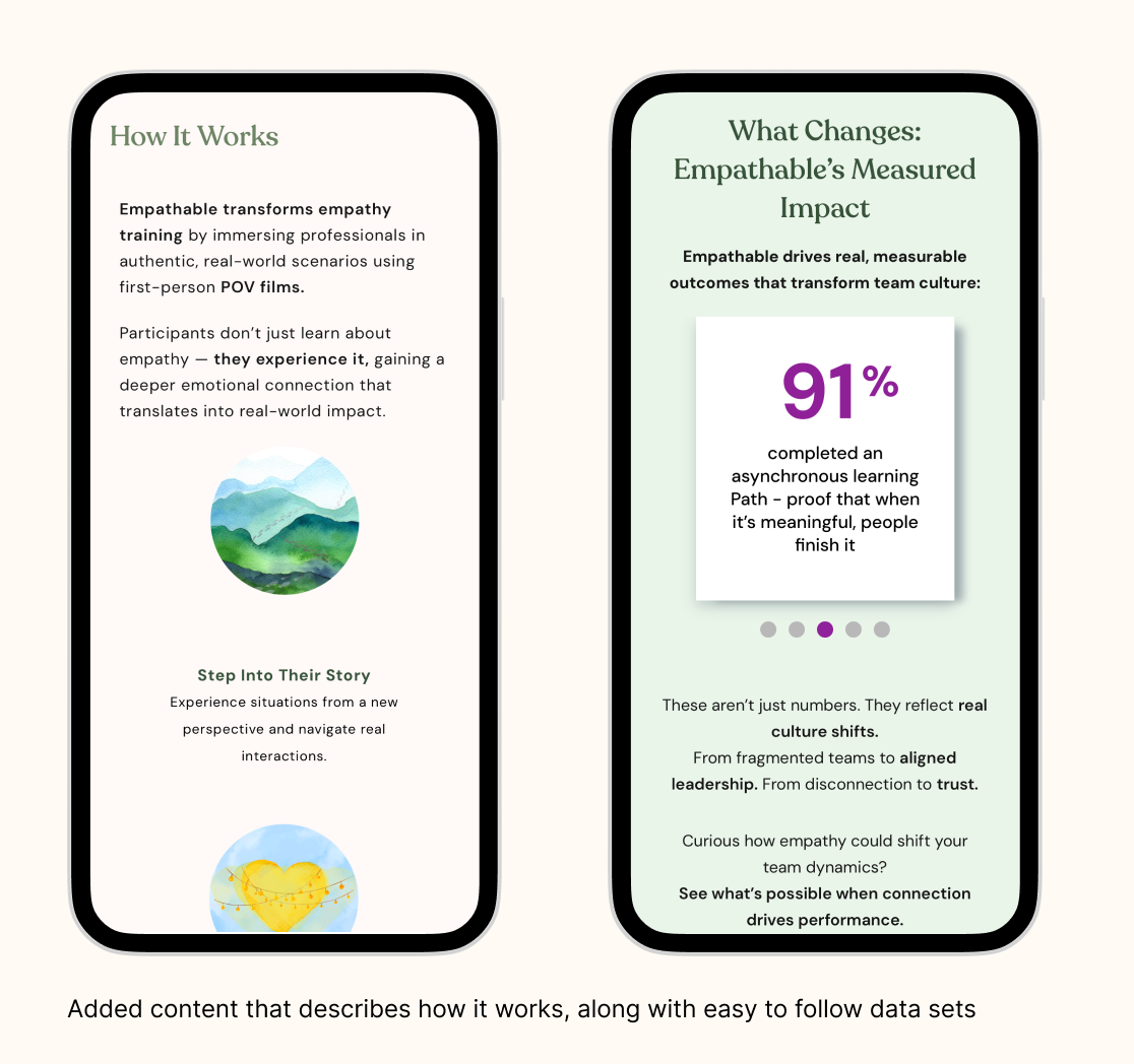
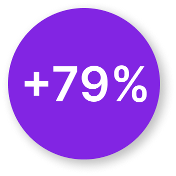
Organic Traffic Increase
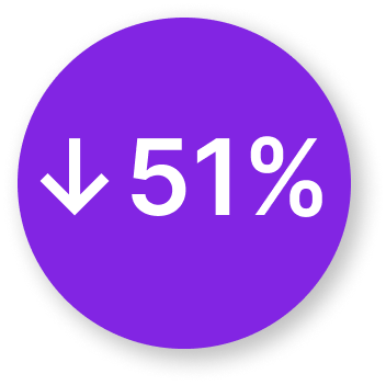
Bounce Rate Decrease (was 70%)
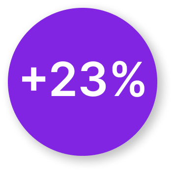
Organic Keywords Increase
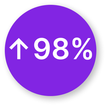
Site Accessibility (Up from 92%)