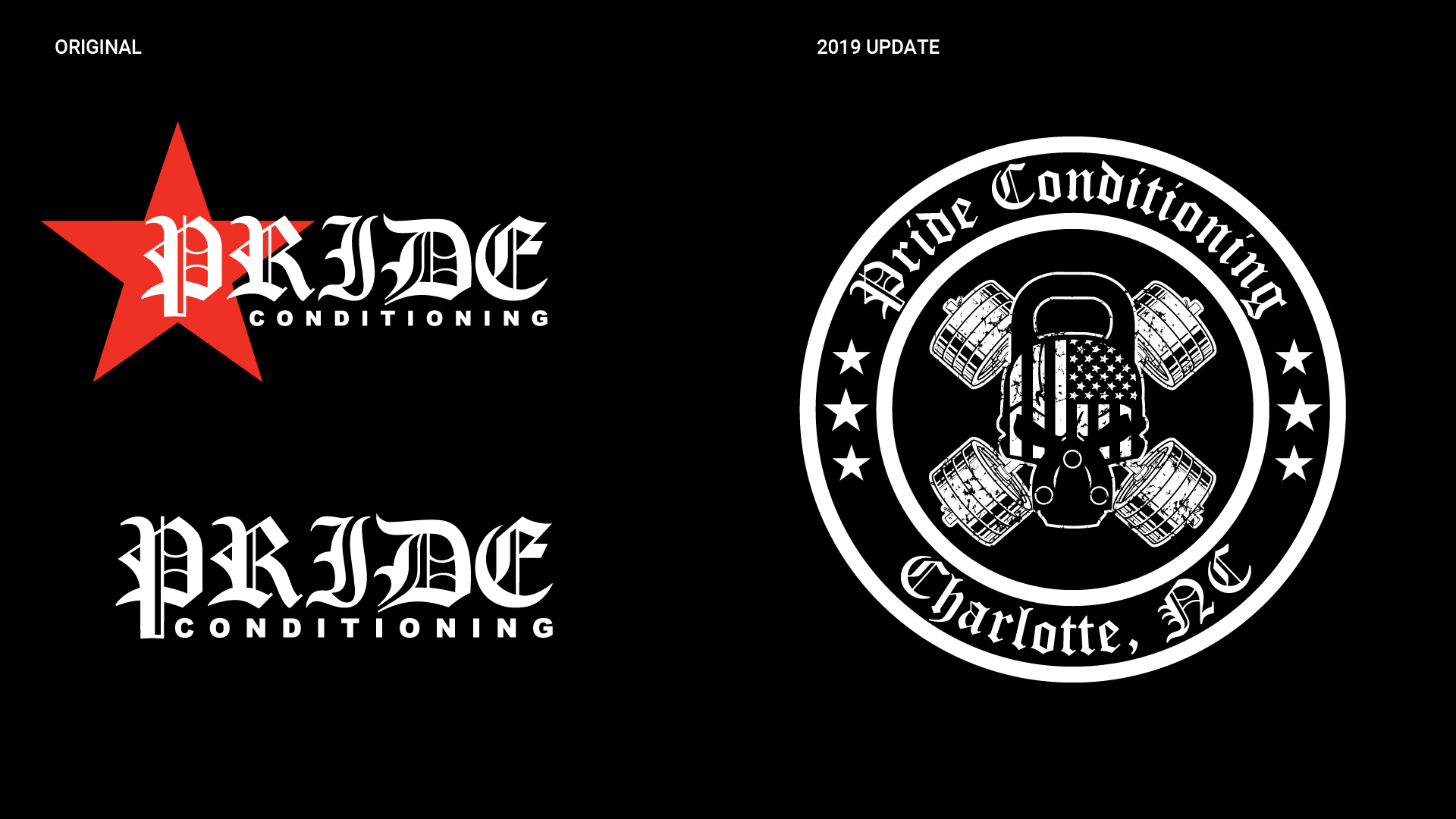
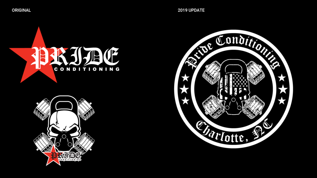
Pride Conditioning – Brand Identity

PrideCOVER

From the gym floor to the competition stage — a brand built to perform.

Background

I built Pride Conditioning's visual identity from the ground up: logo, brand system, apparel, and event collateral for Carolina Carnage II.

  • Context: Charlotte-based gym with a competitive powerlifting community
  • Objective: Complete brand system that works across apparel, digital, and live events

Goal: Bold, cohesive identity that reflects the gym's culture

Case Information

  • Duration

    Ongoing

  • Role

    Designer

  • Tools Used

    Adobe Illustrator, Canva

The Challenge

The brand needed to hold up across a wide range of applications — embroidered on a hoodie, printed on signage, handed out as an award. It also had to feel specific to Pride Conditioning, not generic gym branding.

My Approach

Logo & Identity

Developed two primary marks used in rotation, designed for flexibility across embroidery, print, digital, and signage.
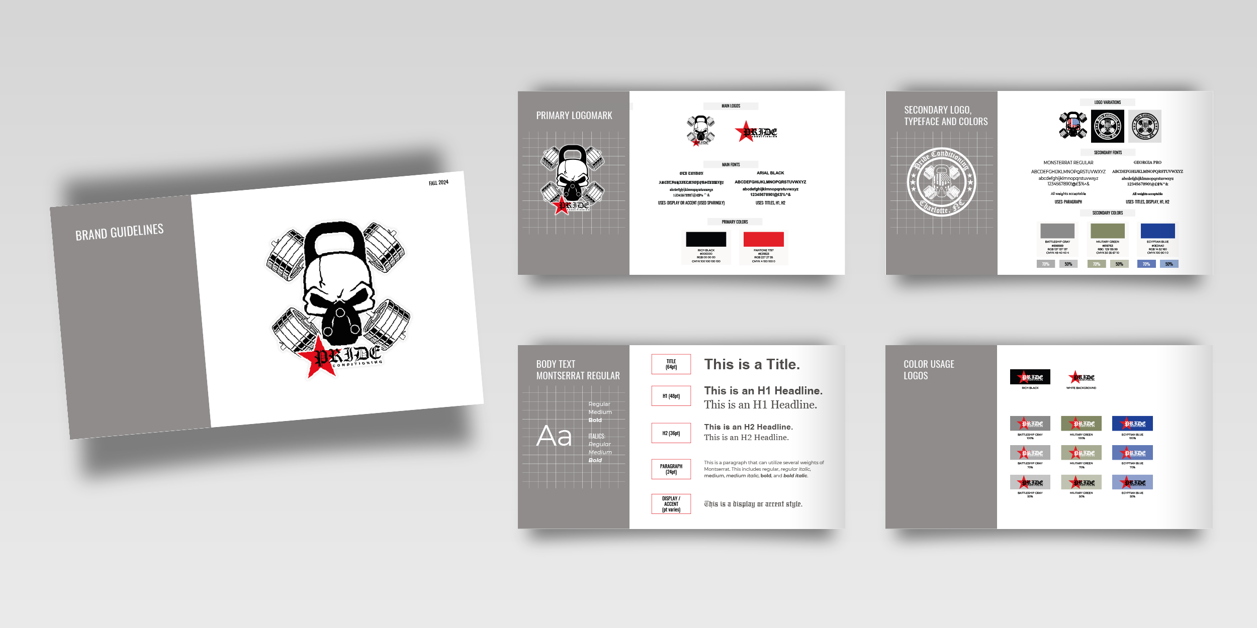
Brand Guide

Logo usage, color palette, typography, and application rules — built so the system stays consistent as the gym grows.
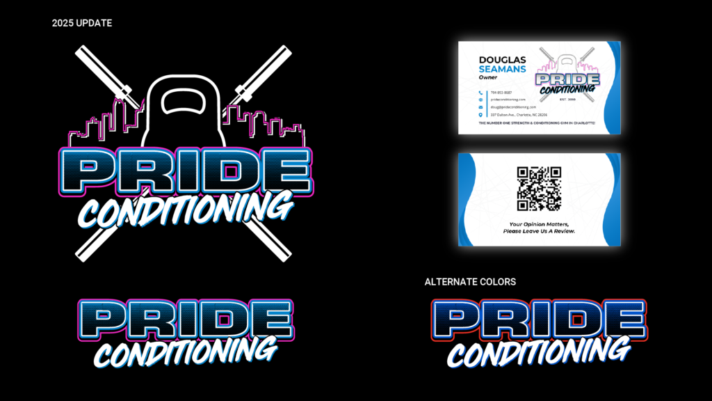
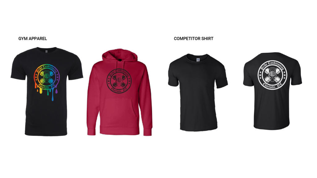
Apparel

Applied the identity to gym apparel designed for everyday wear.

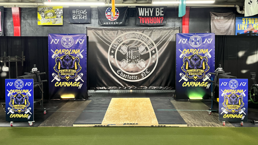
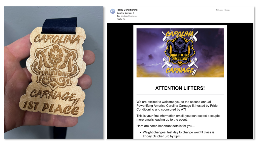
Event Collateral — Carolina Carnage II

Full suite for Pride Conditioning's powerlifting meet: email header, signage, and awards — all on-brand.

Deliverables

  • Logo suite (two primary marks, monochrome variants)
  • Brand guide
  • Apparel design
  • Event collateral (Carolina Carnage II): email header, meet signage, awards

Outcomes

  • Cohesive system across digital, apparel, and live events
  • Identity that scales from embroidery to full-size signage
  • Brand that reflects the gym's competitive, community-driven culture